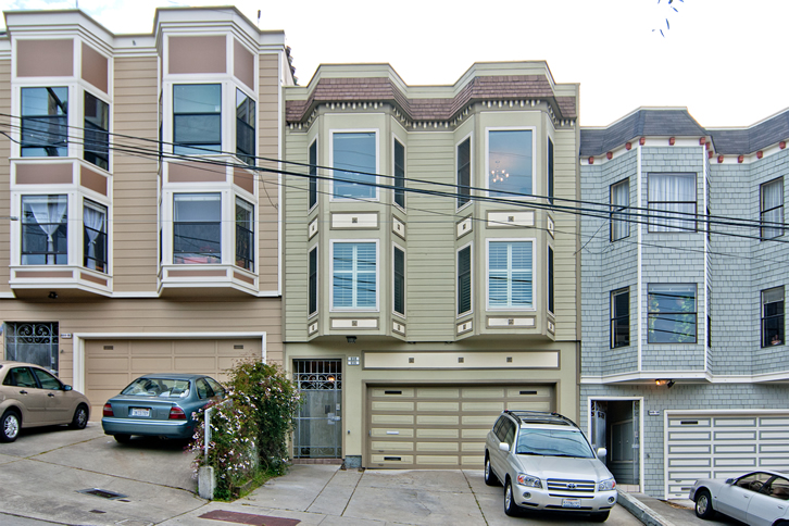
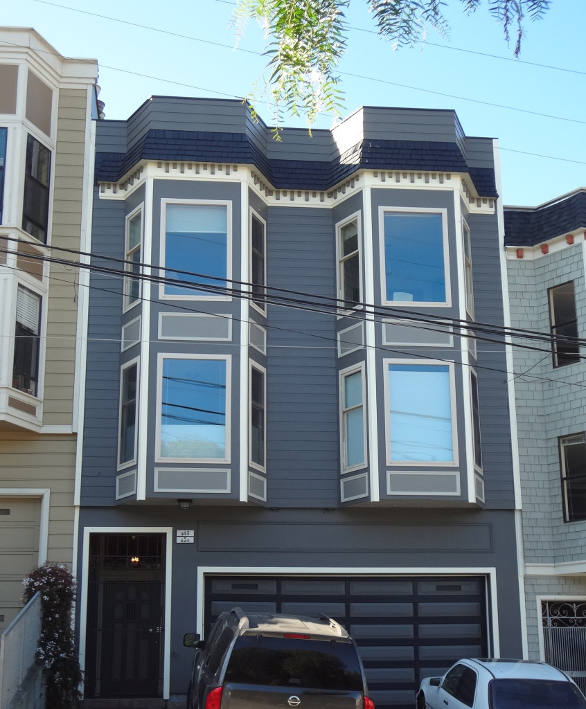
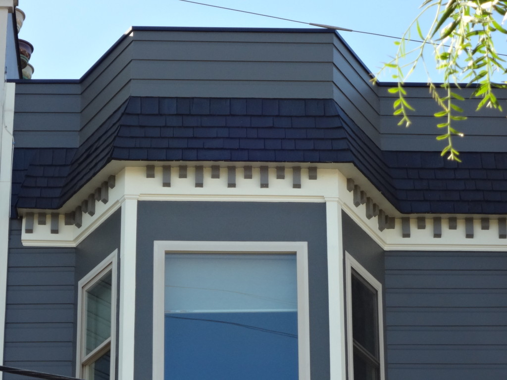
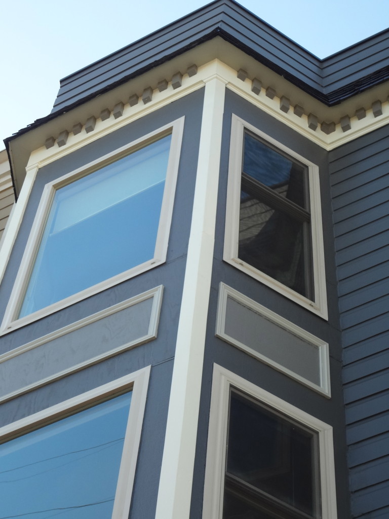
This house looked drab before a color makeover, it just blended in with the other neighboring houses. I could not even tell where the entrance was, it had several mixed messages architecturally. When I got called in to design a color palette for this house, I knew at first glance I wanted to make it handsome!
Before Drab:
After and Handsome:
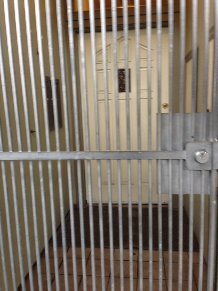
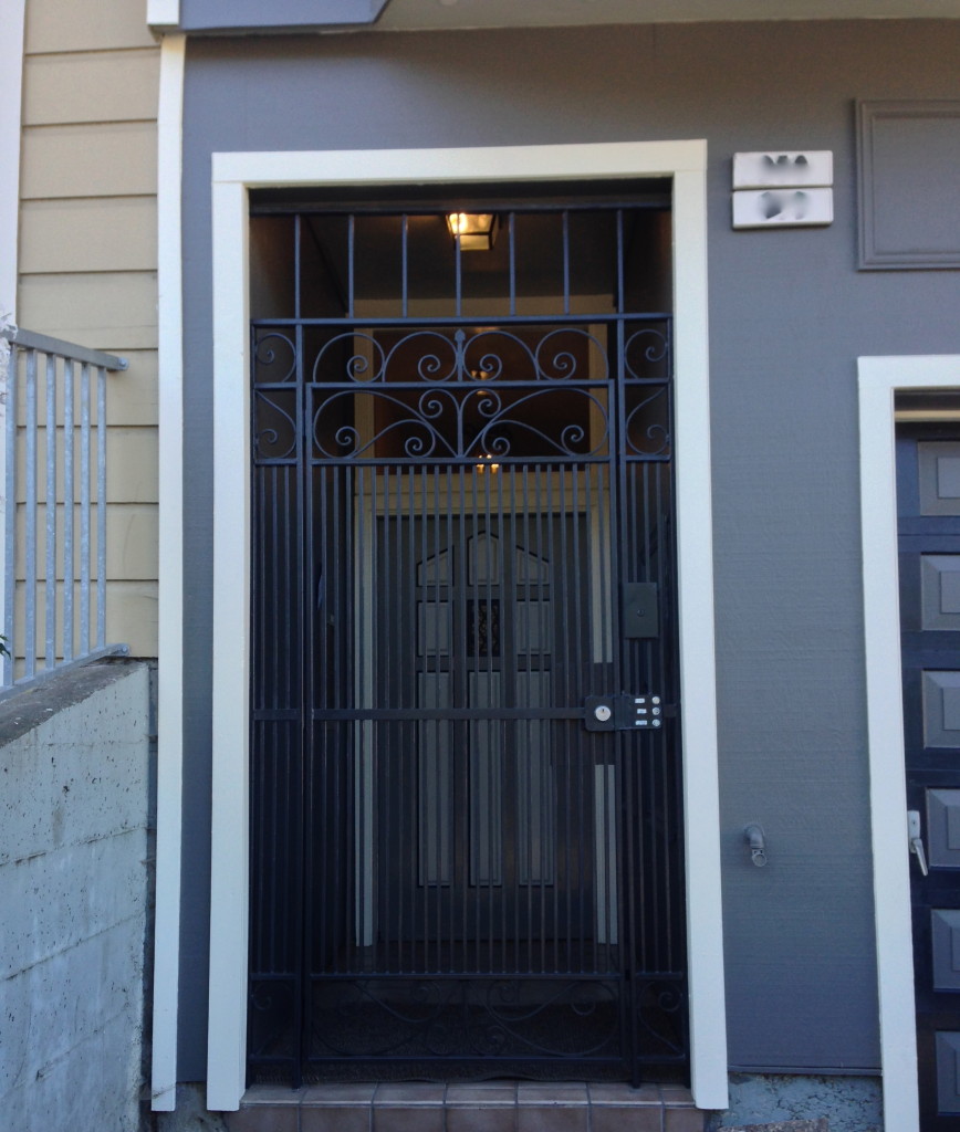
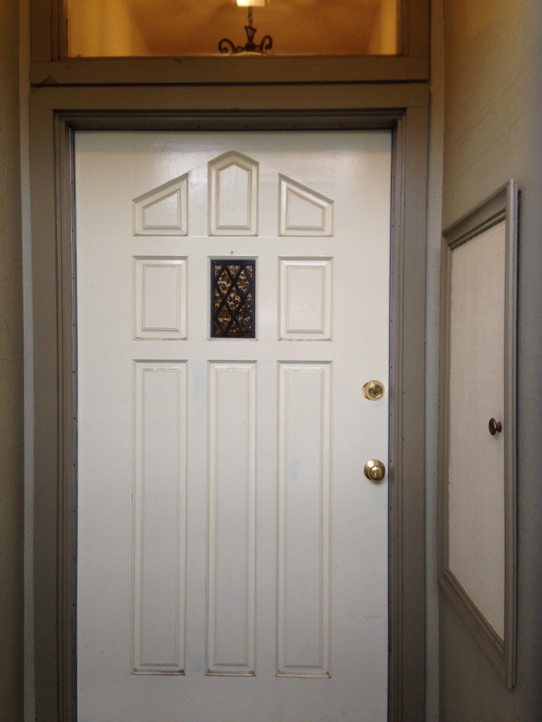
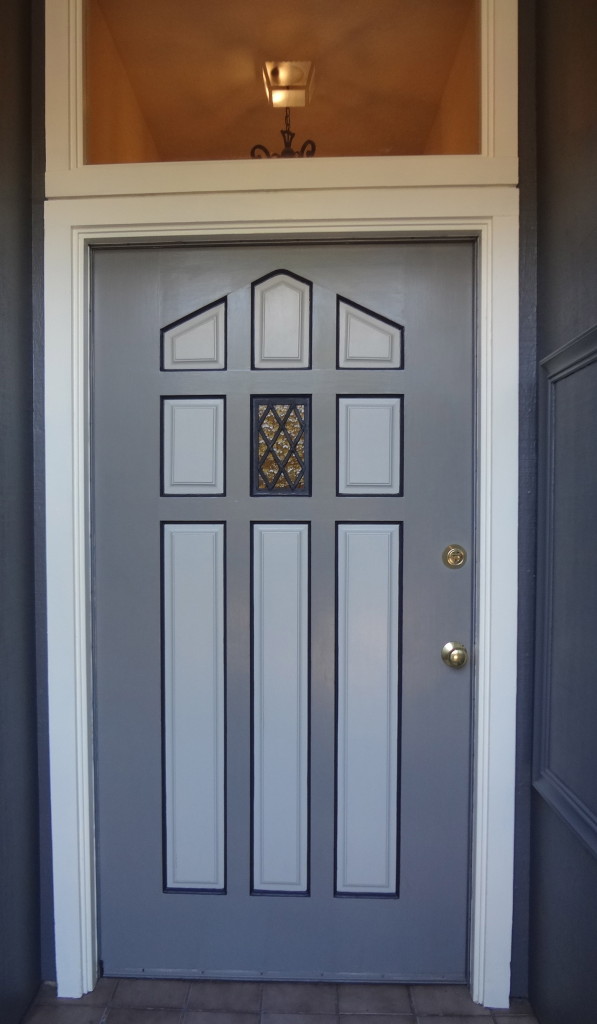
The front gate was metal and jail like, not inviting. By painting it this dark color I was able to bring focus back into the entryway. I also took a dated looking door and by choosing the right paint colors and placement made it look proud.
Gate Before:
Gate After:
Front Door Before:
Front Door After:
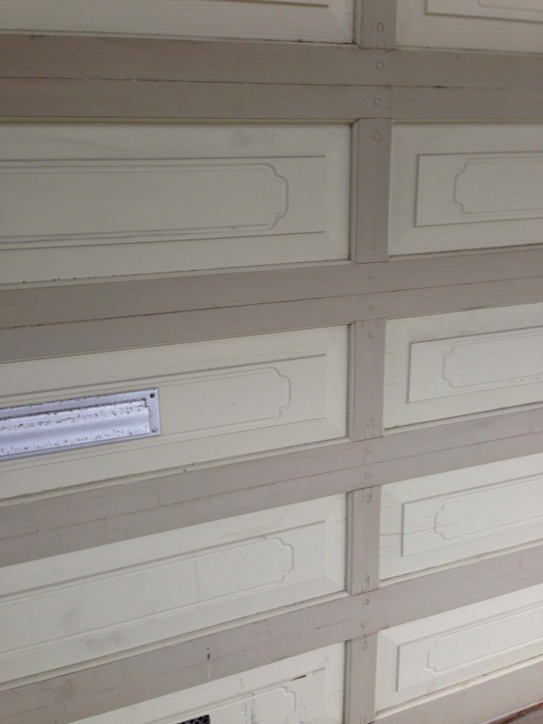
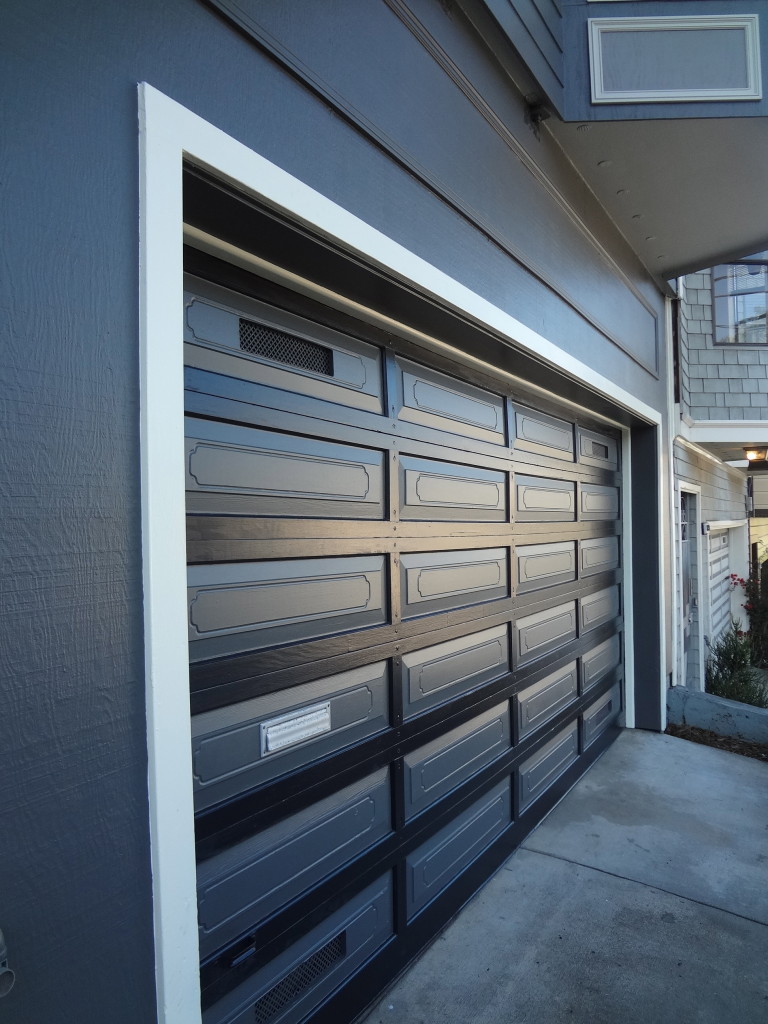
The house seemed off balance with a trim box over the garage doors, so to make that disappear I had it painted the same base color as the house. Voila it’s balanced! No more crooked side burns here. I also had those annoying dots taken out of the trim boxes under the windows. We don’t need architectural acne dots giving us mixed messages right?
Some other touches I did were to paint the underside of the bay windows a lighter color to create depth and interest.
Now this house handsomely stands out from the crowd.
Garage Before:
Garage After:
No more dots in boxes under windows!
